My Role
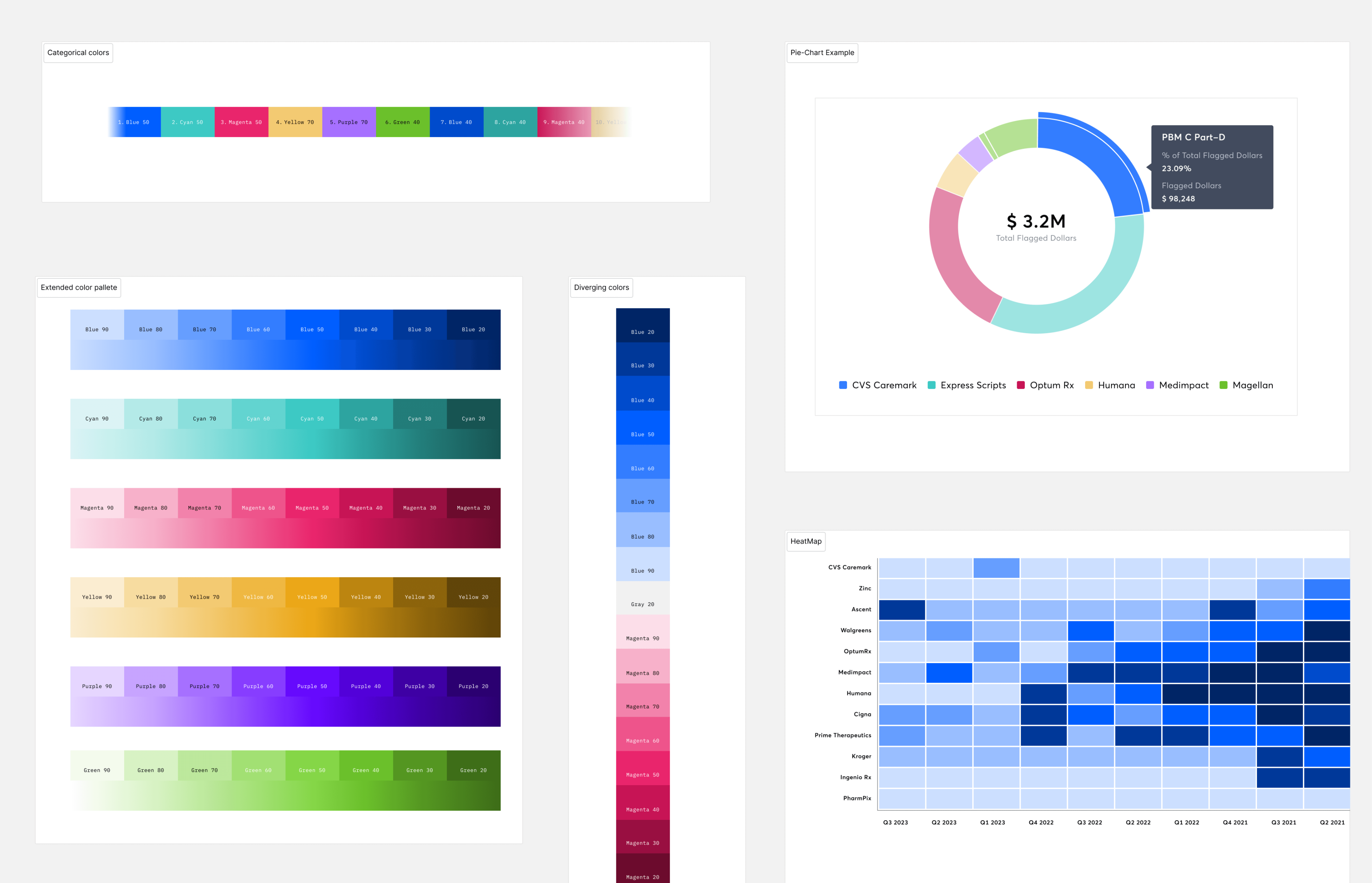
I was brought into the project right after discovery, so I was responsible for the UX of the dashboard. This was the first formal Dashboard of Kalderos Product Ecosystem so I was also responsible for designing all the elements of a data visualization system from colors, components and best practices. I also helped build the data visualization design system for this effort.
Background
Problem
Although Kalderos surfaces this information through the current product, it is highly detailed and fragmented. This lead to our CS teams scrambling to collect this disparate data from various sections of the product ecosystem and generate static reports for our Manufacture Customers. This process was very reactive.
Kalderos’ current tool provides data that is detailed and disparate; proving ineffective to monitor all contracts at once.
Solution
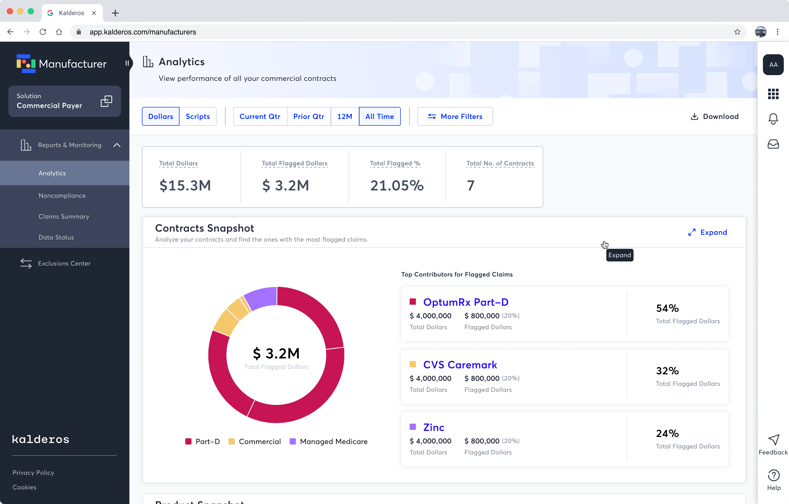
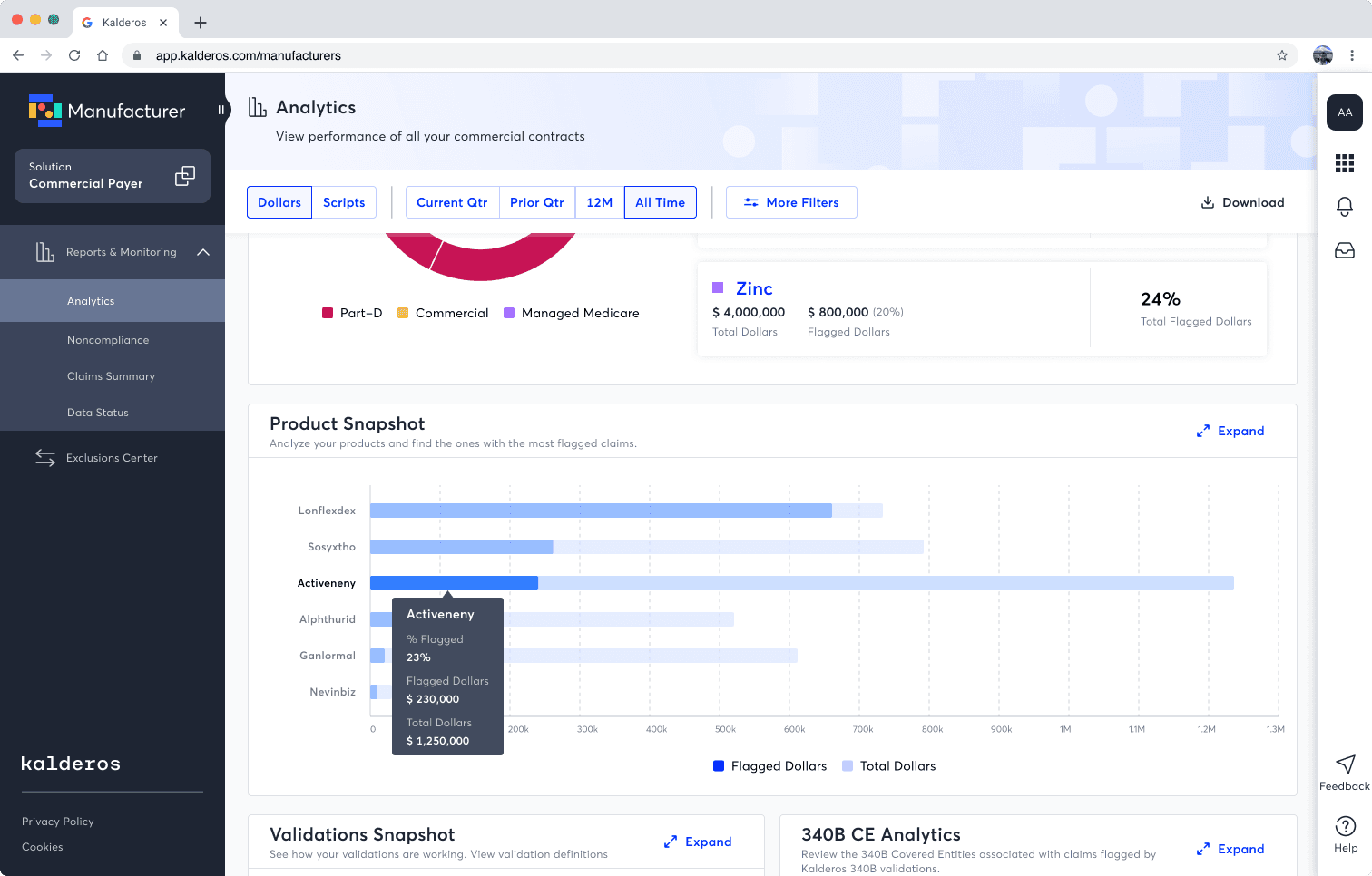
We built data visualization tool leveraging the data we already have in our tool and looking at it in ways that can provide actionable insights. This helps all our smaller manufacturers analyze and find trends in a contract quickly. Armed with data our Manufacturers can help themselves reduce rebates on their contracts, thereby increasing their profit margins.
An Analytical dashboard that helps our users view already existing data in an aggregated format moving from a 'Reactive' to 'Proactive' approach
Solution Spotlight
Impact
We had major setbacks during the launch of this product. This lead to it not being properly socialized amongst the customers leading to less than desired usage. Nonetheless, we were able to learn from our failed hypothesis and pivot to a new feature called “Proportionality” which is soon be launched.
But on the flipside, we were able to onboard 1 new Customer using Contract performance Analytics as a value prop.


